Thursday, 9 May 2013

Unit 20 - P3 M2


P3 Explain the fundamentals of a scripting language &
M2 discuss how a scripting
language can improve
functionality

What is a scripting language?

A scripting language is a type of high-level programming language that when executed is interpreted by another program such as a Browser at the very beginning rather than compiled by the computer's processor. Some of the most popular used scripting language include: JavaScript, Python and VBScript.

Client / Server scripting 

Scripting languages can be embedded within HTML, it’s normally used to add functionality to a Web page, for example; different menu styles or graphic displays or to serve interactive advertisements. These types of ‘languages’ are client-side scripting languages; this is because it affects the data that the person behind the computer screen sees in a browser window.

Server-side scripting languages on the other hand actually manipulate the data from the source, for example a product description in a database which is on the server. So client-side scripting only affects a specific user once activated, for example: rolling the cursor over a navigation button – that person would see that the button high-lights and not everyone else would see that change unless they follow the exact same actions. Server-side scripting would affect everyone visiting the website immediately. Things such as product description on an e-commerce website; once change from the server everyone visiting that website would see the changed description.

A scripting language is different from a programming language in the sense that a command can be used in a scripting language and executed straight away whereas a programming language translates the command into a readable format which the system then runs. For example a PC game where programming languages such as C++ is used this is because games require high levels of programming that can’t be executed immediately and need to be compiled by such programming languages. Simple tasks on the other hand such as high-lighting a button or browser-detection to find out what browser the user is using and adjust the website code accordingly.


Client Side

In Client side the scripting does all the calculations on the user's computer. The web browser or a plugin reads the script and converts it into a visual web page.Most of the information that the user enters into the website stays in the client side and sometimes sent back to the server.

Client Side advantages 

  • Allow for more interactivity by immediately responding to user's actions 
  • May improve the usability of web sites for users who's browsers support scripts 
  • Can give developers more control over the look and behavior of their web widgets 
  • Secure as it is protected which means it is not possible to read by users, prevents it from being stolen

Client Side disadvantages

  • Not all browsers support scripts therefore users might experience errors if no alternatives are provided
  • Different browsers and browser versions support scripts differently thus more quality testing is required
  • More development time and effort might be needed


JavaScript 

JavaScript is a scripting language that was developed by Netscape to enable web creators to design interactive sites. JavaScript is an open language that anyone can use without having to buy a license. One of the tasks that JavaScript is able to do is that it can interact with the HTML code of a website which enables website creators to put in dynamic content in their sites. All browsers today support JavaScript as it is a crucial part of our everyday browsing experience. We may not notice it but it’s on nearly every website; from e-commerce websites such as amazon and e-bay to watching videos on YouTube. For example with JavaScript you can add animations to a website to attract customers and if the user clicked on the animation it could take them to a certain page on the website. In conclusion, JavaScript allows people to build highly responsive user interfaces, prevent frustrating page reloads and even fix issues for CSS.


jQuery 

What is jQuery? jQuery is not a language, but instead is a well written JavaScript code. jQuery almost simplifies basic tasks that you would want to happen in a web browser. It is very useful because the simple things such as making a pop-up box appear in a website when a button is pressed could be written in as little as 2/3 lines of jQuery whilst in JavaScript it would take a whole page of coding. This is because it is its own library where it stores all the information related to jQuery so that you do not need to define each and every single aspect. jQuery helps to implement user interface related functionality without having to write hundreds of lines of codes, in other words; it’s simple, clean and fast.

References:
JavaScript, 09/05/2013, http://bit.ly/93VJ
Client side vs Server side, 09/05/2013, http://bit.ly/10fA4RK

Thursday, 14 March 2013

Unit 28 - P4 M2 Website Design


Unit 28 P4 - Website Design

In this post I will be talking about what my website is about. 
My website is called FastBikes and is about selling different types of motorcycles, protective gear and accessories all over the UK. These motorcycles can be bought by using a finance options which allows people to pay in monthly installments or have the easier option by paying all upfront. The business itself runs completely online; the motorcycles are kept in garages and shipped of when bought using a third party courier. By not having a physical store where customers can come in and view the bikes we make huge savings and we pass these savings straight onto the customer ensuring very low prices!

Who it's for
My website is for people who have just passed their test or are long term Motorcycle enthusiast who want a new reliable motorcycle from a website that they can trust. The motorcycle that are for sale would suit anyone from a 17 year old beginner who has just started riding all the way up to 40 year old professional experienced riders. Our audience is mostly target at people who enjoy riding really fast bikes of its kind.


The structure of my website is as follows:

Navigation


Page design & content:

                     Homepage

The homepage has my massive logo as a header on the top of the website and right underneath it is my navigation bar which links to four other pages. The page content is just an introductions explaining what kind of bikes we sell, and to the left of the text there are two pictures of one of the bikes that we sell.


                    Motorcycles

The range of Motorcycles I will sell has four main areas which is as follows:

1: Yamaha YZF R125
2: Yamaha XJ6
3: Suzuki GSXR600
4: Kawasaki Ninja 250

In this page i showcase the motorcycles that are on sale; each are equally sized pictures I have split in 4 different locations on my website that make up my links which makes it very easy to navigate to.


                         Extras

The range of Extras I will be selling is as follows:

1: Helmets
2: Jacket & Gloves
3: Trousers & Shoes
4: Bike Accessories

Again I have four different pictures to clearly display what's on sale; each which have links. This page only sells accessories and that's what's displayed on this page.


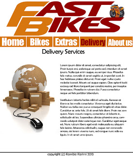
                         Delivery


The range of Delivery I will provide is as follows:
1: International Delivery
2: UK & Mainland

This web page contains a phone number and e-mail for users who are interested in purchasing a motorcycle but would like to discuss delivery before hand. It doesn't have external links as it only gives users information on national and international delivery services.


                        About us

About us page will contain the following:
1: Who we are and what we do
2: Customer service phone number and e-mail

This webpage doesn't contain any external links as it only provides basic information of what my website is about (selling motorcycle, providing excellent delivery services) this is so that any potential customers will be satisfied not only after their purchase but also before they even buy one.


Unit 28 M2: Tools and Techniques used to create my website

Within this section I will talk about all of the tools and techniques that I have used to create my website and explain how I implemented each.


HTML

Hypertext Mark-up Language otherwise known as HTML is the language in which web pages are written in. HTML is made up of elements called tags that build the contents of a web page. It is designed to alter how text and images are presented in web browsers.
These tags describe the contents of the web page; there are various programs out there today that have an easy to use UI which pre-insert these tags as you type them whilst having a split screen preview to make it even easier to create websites. HTML is a fairly easy code to be learnt, HTML can be read by people and not just computers for example: most people could guess what the <img> tag does.

In my website I have used HTML to position my text and images as well as my navigation bar and any other buttons. For example my navigation is simply a list which has the following code:

<ul>
                    <li><a href="index.html">Home</a></li>
                    <li><a href="bikes.html">Bikes</a></li>
                    <li><a href="extras.html">Extras</a></li>
                    <li><a href="delivery.html">Delivery</a></li>
                    <li><a href="aboutus.html">About us</a></li>
        </ul>

This would simply create a list with bullet points on my web page; that’s where CSS comes in. To be able to turn this into a navigation, I used CSS to alter the looks of the list.


CSS
Cascading Style Sheets otherwise known as CSS enables to change the style of web pages. CSS is the technical specifications for a layout. Every web page we look at has been altered by at least one style sheet. CSS is created to make it easier for web developers to change the way websites look by changing small factors such as font, padding and colors.  Continuing from my previous example; If I have a list of a items which are presented in bullets points which I want to remove to make it only a list I would add the following code:

#navigation ul li
{
    list-style-type:none;
    display:inline;

}

This would remove all styles that are pre-attached when using <ul> <li> tags, leaving us with just a list of items which we then turn into navigation bars using more CSS.

Another example is my roll over buttons. In my website when a user rolls over one of my navigation buttons the button turns from orange to dark red. This makes it much easier for users to realize that it's a link. The  code that is attached to this is in my style.css sheet which is as follows:

 #navigation ul li a:hover
{
    background:#930202;
    text-decoration:underline;

}

What this does is that it changes the background color and underlines the text when the mouse is hovering over the button. Designers can also add further developments to this such as animation and other colors when clicking the buttons.


Komodo Edit
Komodo Edit is a free multi-language editor that has a sleek interface which enables users to code in many web languages such as Python, PHP, Ruby, Perl, HTML, CSS and JavaScript. The two that I have mainly used are HTML and CSS. Komodo Edit is widely compatible with many different operating systems including Windows, Linux and Macintosh. I have used Komodo Edit to create my entire website using HTML and CSS. Komodo Edit assisted me in doing so by allowing me to have a split screen between my code and a preview of my website. This helped me allot as I could easily change code and see the changes immediately. Komodo Edit also helped me insert code; it does this by guessing what tag I’m about to write.

For example If I am writing <a hr… it will suggest <a href =”   so then I can start typing the link to whatever it is I am linking straight away. Komodo Edit also set me up with the basic templates that it provides. When I started of making my websites I use a HTML 5 with CSS template which was very useful as it already had the first few bits of code to set me up creating my website.

Here is a picture of how Komodo Edit looks like:


Gliffy (Wireframe tool)
Gliffy is a web-based application which enabled me to create my website wireframes. It has a drag and drop user interface with the ability to add boxes, buttons, and lines from the tool shape library to anywhere on the page. You can also easily add mock-up text to create a clear image of where things should be going without having to type it up. Gliffy allowed me to have access to a massive library of shapes; I could even import my own images such as logos and backgrounds. However I just used the library of shapes to create the wireframe for my website as there was no need to add image to a wireframe of my website.


Photoshop (Graphics program)
Photoshop is a high end image editing / creation software. Because I was already skilled with using Photoshop I decided to use it. I used Photoshop to create various parts of my website including: My website design, my logos, re-sizing and cropping pictures. Photoshop has a whole variety of tools that enabled me to create boxes, shapes, customer colors, highlights, glows and so forth. One of the things that I did in Photoshop is that I removed the background of my motorcycle, which i then added to the massive logo of my website to give it a very clean look. I made my website design simply by using boxes and lines which I then colored accordingly.


Lorem Ipsum / lorem pixel
Lorem Ipsum is a group of text that people commonly use as filler text, or dummy text.  It’s basically a bunch of text that doesn't make sense because it’s only used to show what a design layout will look like when the actual text has been inserted. Lorem Ipsum isn't really a program or software, it’s just a website containing different samples of Lorem Ipsum text and users can copy as much or as little as they want: short lists, long paragraphs etc.

Lorem Pixel is very similar; instead of text users can simply generate pictures instead. Lorem Pixel is generated by using a URL within the source of an image. To be able to get exact sizes designers simply change the URL link which ends with /100/100 to whatever their dimensions are. E.g. 500 pixels by 400 pixels. Lorem Pixel will simply generate a random picture each time the page is refreshed or revisited. This make it easy to see how picture will look like without actually having to manually get an image and place it in your documents to be able to preview how it looks like.


References:
Lorem Pixel, 12/03/2013, http://bit.ly/pkNkXG
What is Photoshop, 12/03/2013, http://bit.ly/nmW38s
Gliffy, 12/03/2013, http://bit.ly/JfKbeo
Active state Komodo, 12/03/2013, http://bit.ly/10SZlW
Implementing CSS, 12/03/2013, http://bit.ly/Mps5rk
What is HTML, 12/03/2013, http://bit.ly/XbcRuF

Sunday, 16 December 2012

Unit 20 - M1 Assess different implementation styles of CSS


Unit 20 - M1
Assess different implementation styles of CSS


Below I will explain the advantages and disadvantages of different implementation styles of CSS


External CSS - There are many advantages for using external CSS; one of which is that external CSS reduces the risk of coding errors. This is because you only have one external file that contains all your code; this code cosmetically formats all the pages and so should there be an error you can simply change where the error has occurred whilst in inline CSS you would have to go about and look through each and every single page to find the error and fix them. Another advantage of using external CSS is that it allows full control of page structures and keeps your website and content isolated. Therefore it is much easier to reuse the CSS code if you have it in a separate file compared to when its combined into one. Another advantage is that by using external CSS it reduces page load timing meaning the speed of the page loading is faster which then increases user satisfaction. Also with external CSS when styling text in a separate file the web designers can considerably decrease the file size of the web pages as it is not part of the actual .html file. 

Conversely, there are some disadvantages to external CSS. One of which is that external CSS can increase the download time if it is very large which would cause the speed of the webpage to be considerably slower. Similarly if there are only a small number of styles it can increase the difficulty of maintain the website. And finally external style sheets can gain file size very quickly and it is quite hard to know when a style is no longer used this is because it won’t magically disappear just because the style isn’t being used and so the user would have to manually remove them.


Embedded CSSWith embedded styles sheets the web developer can style the different anchor tags, whereas it is impossible to do so with inline styles. Embedded styles do not need a web designer to apply the styles to every single element of the web page. Likewise no extra downloads are needed to receive style information as we have fewer HTTP request. 

A disadvantage of using embedded styles is that it can't be used for multiple documents for example if you want to use one style on multiple different web pages. Similarly as there are less HTTP request by using embedded CSS the website will load slower compared to inline CSS. And finally, as useful as embedded CSS is to designing a single page website, if the project suddenly becomes more than one page, then embedded CSS is going to become inconvenient and very ‘bulky’.
<!--[if !supportLineBreakNewLine]-->
<!--[endif]-->

Inline CSS Inline CSS can be used for various things such as testing websites. Plenty of web developers use inline CSS when creating a new website this is because it makes it much easier to work with; for example: it’s much simpler to scroll up in the actual source itself than to go back and change the source file. Moreover inline CSS is less time consuming and should any problems arise they are much quicker to be solved. Websites such as this one; blogs, where there’s only a limited amount of pages available by using inline CSS it helps users by being able to have constantly different styles all throughout. Another advantage of inline CSS is that it lowers HTTP requests which basically means the website loads much faster and therefore users are less likely to click away or simply become frustrated for waiting too long.

Nevertheless, the disadvantage of inline CSS is that inline styles have to be applied to every element that you want them on; for example if you want all your paragraphs to be the colour blue you will have to add an inline style to each relevant <p> tag within the file. This is much more time consuming and creates more of a work load for the designer whilst also increasing the download time for the users visiting that website by ever so little. And finally with inline styles you can only code the link itself and not various other components since that's what the style attributes are linked to. 

References:
CSS How to, 15/12/2012, http://bit.ly/67RTT
3 Types of CSS styles, 15/12/2012, http://bit.ly/W1PV3g
Implementing css, 14/12/2012, http://bit.ly/Mps5rk

Saturday, 15 December 2012

Unit 20 - P2 Explain the features of the box model for CSS


Unit 20 - P2 Explain the features of the box model for CSS

The design and layout of html is shown through the form of a "box model". This is crucial for creating a well laid out and presented website which will create a clean yet simple design that will help users with their needs via the website. 
 
The box model simply ‘wraps up’ other boxes around the foundations which can consist of margins, borders, padding and footers. The box model allows a web developer to be able to change any part of the dimensions of the box and make it fairly easy to read each part of the website for a person to read.


There are four main layers:

1. Margin – The margin simply creates an area around the border of the box; the margin is not visible and therefore blends in with the website background itself. The margin lets space from the outside of the box to be left empty by a certain amount (depending on what the coder inputs).

2. Border - The border goes around both the padding and the content. The border is not transparent and so can have its own colour. Its thickness and type can also be changed, for example: five pixels thick with a dotted line style.

3. Padding - The padding is a clear space between the content and border and it just adds space to a specific region where the content is placed in so that it will be easier to read for users. The padding does this by having a space making sure the border isn’t touching the text or too close; it’s this that makes it easier to read. is can be easy to read and so the border does not touch the content.

4. Content – This is fairly self-explanatory as the contents sits right in the middle of all the layers. All the layers I have mentioned will be around the content.

Also the overall width or height can be defined with each box model although you may also change specific sides of the box such as have a greater padding from the left to get clearance from the edge of the browser. The box will have to be defined with a div tag which will then relate it to the class in the stylesheet.

Here is an example of a box being defined with a div tag and then in used in the stylesheet:

The html file will have:

<div class="box"> *content*  </div>


The cascading style sheet will have:
<!--[endif]-->
.box {
width: 400px;
padding: 20px;
border: 5px solid black;
margin: 10px;
}

Every single part of the box is set through the style sheet for example the: width, height, padding, colour etc…

References:

8 Box model, 14/12/2012, http://bit.ly/H4hj0
The CSS box model, 12/12/12, http://bit.ly/4goNJE

Friday, 30 November 2012

Unit 20 - P1 Explain how HTML files access CSS


Unit 20 - P1
Introduction
Within this blog I will show the 3 different types of CSS embedding. Inline, Internal, External

INLINE: Inline CSS adds styling to individual HTML elements. They are good if you want specific pages to have a different CSS than others. But if not inline CSS must be applied to each HTML element you wish to style; this can be very time consuming. Inline will always overwrite external. Inline is the best for when the code only needs to be used once. This is because if the same code needs to be repeated several times on different pages you are better of using external.

INTERNAL: This is about not having to refer to an external style sheet. Internal is better for coding if only one specific web page needs to use the code. Otherwise it is hard to keep the flow with it on many different pages. So we can use “<style type="text/css"> to look within the html document itself. 

Here is an example:


<head>
<style>
h1{
color: red}
</style>
</head>

<head> Everything that goes in the head tag contains everything that has to be there before anything is done, it tells the browser what is coming up.

EXTERNAL:
We have this so that you don't have to constantly put the CSS within the HTML file. By linking an external stylesheet you can make one CSS file that applies to all of your webpages. For example here is some CSS coding you could have in the external stylesheet: in every page you would have the line:
<link rel="stylesheet" href="style.css"> to link the style sheet to the html files.
External CSS allows you to control many different documents at the same time.


REFERENCES

What is Internal CSS, 30/11/2012, http://anse.rs/11pfLQG
CSS Advantages, 30/11/2012, http://bit.ly/XHrDeW