Unit 28 P4 - Website Design
In this post I will be talking about what my website is about.
My website is called FastBikes and is about selling different types of motorcycles, protective gear and accessories all over the UK. These motorcycles can be bought by using a finance options which allows people to pay in monthly installments or have the easier option by paying all upfront. The business itself runs completely online; the motorcycles are kept in garages and shipped of when bought using a third party courier. By not having a physical store where customers can come in and view the bikes we make huge savings and we pass these savings straight onto the customer ensuring very low prices!
Who it's for
My website is for people who have just passed their test or are long term Motorcycle enthusiast who want a new reliable motorcycle from a website that they can trust. The motorcycle that are for sale would suit anyone from a 17 year old beginner who has just started riding all the way up to 40 year old professional experienced riders. Our audience is mostly target at people who enjoy riding really fast bikes of its kind.
The structure of my website is as follows:
Navigation
Page design & content:
Homepage
The homepage has my massive logo as a header on the top of the website and right underneath it is my navigation bar which links to four other pages. The page content is just an introductions explaining what kind of bikes we sell, and to the left of the text there are two pictures of one of the bikes that we sell.
Motorcycles

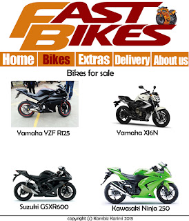
The range of Motorcycles I will sell has four main areas which is as follows:
1: Yamaha YZF R125
2: Yamaha XJ6
3: Suzuki GSXR600
4: Kawasaki Ninja 250
In this page i showcase the motorcycles that are on sale; each are equally sized pictures I have split in 4 different locations on my website that make up my links which makes it very easy to navigate to.
Extras
The range of Extras I will be selling is as follows:
1: Helmets
2: Jacket & Gloves
3: Trousers & Shoes
4: Bike Accessories
Again I have four different pictures to clearly display what's on sale; each which have links. This page only sells accessories and that's what's displayed on this page.
Delivery

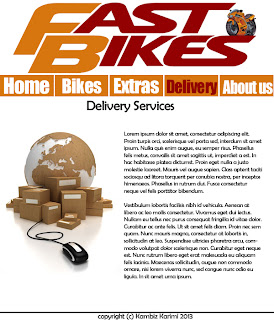
The range of Delivery I will provide is as follows:
1: International Delivery
2: UK & Mainland
This web page contains a phone number and e-mail for users who are interested in purchasing a motorcycle but would like to discuss delivery before hand. It doesn't have external links as it only gives users information on national and international delivery services.
About us
About us page will contain the following:
1: Who we are and what we do
2: Customer service phone number and e-mail
This webpage doesn't contain any external links as it only provides basic information of what my website is about (selling motorcycle, providing excellent delivery services) this is so that any potential customers will be satisfied not only after their purchase but also before they even buy one.
Unit 28 M2: Tools and Techniques used to create my website
Within this section I will talk about all of the tools and techniques that I have used to create my website and explain how I implemented each.
HTML
Hypertext Mark-up Language otherwise known as HTML is the
language in which web pages are written in. HTML is made up of elements called
tags that build the contents of a web page. It is designed to alter how text and
images are presented in web browsers.
These tags describe the contents of the web page; there
are various programs out there today that have an easy to use UI which pre-insert
these tags as you type them whilst having a split screen preview to make it
even easier to create websites. HTML is a fairly easy code to be learnt, HTML
can be read by people and not just computers for example: most people could
guess what the <img> tag does.
In my website I have used HTML to position my text and
images as well as my navigation bar and any other buttons. For example my
navigation is simply a list which has the following code:
<ul>
<li><a href="index.html">Home</a></li>
<li><a
href="bikes.html">Bikes</a></li>
<li><a
href="extras.html">Extras</a></li>
<li><a
href="delivery.html">Delivery</a></li>
<li><a
href="aboutus.html">About us</a></li>
</ul>
This would simply create a list with bullet points on my
web page; that’s where CSS comes in. To be able to turn this into a navigation,
I used CSS to alter the looks of the list.
CSS
Cascading Style Sheets otherwise known as CSS enables to
change the style of web pages. CSS is the technical specifications for a layout.
Every web page we look at has been altered by at least one style sheet. CSS is
created to make it easier for web developers to change the way websites look by
changing small factors such as font, padding and colors. Continuing from my previous example; If I have
a list of a items which are presented in bullets points which I want to remove
to make it only a list I would add the following code:
#navigation ul li
{
list-style-type:none;
display:inline;
}
This would remove all styles that are pre-attached when using <ul> <li> tags, leaving us with just a list of items which we then turn into navigation bars using more CSS.
Another example is my roll over buttons. In my website when a user rolls over one of my navigation buttons the button turns from orange to dark red. This makes it much easier for users to realize that it's a link. The code that is attached to this is in my style.css sheet which is as follows:
#navigation ul li a:hover
{
background:#930202;
text-decoration:underline;
}
What this does is that it changes the background color and underlines the text when the mouse is hovering over the button. Designers can also add further developments to this such as animation and other colors when clicking the buttons.
Komodo Edit
Komodo Edit is a free multi-language editor that has a sleek
interface which enables users to code in many web languages such as Python,
PHP, Ruby, Perl, HTML, CSS and JavaScript. The two that I have mainly
used are HTML and CSS. Komodo Edit is widely compatible with many different
operating systems including Windows, Linux and Macintosh. I have used Komodo
Edit to create my entire website using HTML and CSS. Komodo Edit assisted me in
doing so by allowing me to have a split screen between my code and a preview of
my website. This helped me allot as I could easily change code and see the
changes immediately. Komodo Edit also helped me insert code; it does this by
guessing what tag I’m about to write.
For example If I am writing <a hr… it will suggest
<a href =” so then I can start
typing the link to whatever it is I am linking straight away. Komodo Edit also
set me up with the basic templates that it provides. When I started of making
my websites I use a HTML 5 with CSS template which was very useful as it
already had the first few bits of code to set me up creating my website.
Here is a picture of how Komodo Edit looks like:
Gliffy (Wireframe tool)
 Gliffy is a web-based application which enabled me to
create my website wireframes. It has a drag and drop user interface with the
ability to add boxes, buttons, and lines from the tool shape library to
anywhere on the page. You can also easily add mock-up text to create a clear
image of where things should be going without having to type it up. Gliffy
allowed me to have access to a massive library of shapes; I could even import my
own images such as logos and backgrounds. However I just used the library of
shapes to create the wireframe for my website as there was no need to add image to a wireframe of my website.
Photoshop (Graphics program)
Photoshop is a high end image editing / creation software. Because I was already skilled with using Photoshop I decided to use it. I used Photoshop to create various parts of my website including: My website design, my logos, re-sizing and cropping pictures. Photoshop has a whole variety of tools that enabled me to create boxes, shapes, customer colors, highlights, glows and so forth. One of the things that I did in Photoshop is that I removed the background of my motorcycle, which i then added to the massive logo of my website to give it a very clean look. I made my website design simply by using boxes and lines which I then colored accordingly.
Lorem Ipsum / lorem pixel
Lorem Ipsum is a group of text that people commonly use
as filler text, or dummy text. It’s
basically a bunch of text that doesn't make sense because it’s only used to
show what a design layout will look like when the actual text has been
inserted. Lorem Ipsum isn't really a program or software, it’s just a website
containing different samples of Lorem Ipsum text and users can copy as much or
as little as they want: short lists, long paragraphs etc.
Lorem Pixel is very similar; instead of text users can
simply generate pictures instead. Lorem Pixel is generated by using a URL
within the source of an image. To be able to get exact sizes designers simply
change the URL link which ends with /100/100 to whatever their dimensions are.
E.g. 500 pixels by 400 pixels. Lorem Pixel will simply generate a random
picture each time the page is refreshed or revisited. This make it easy to see
how picture will look like without actually having to manually get an image and
place it in your documents to be able to preview how it looks like.
References:
Lorem Pixel, 12/03/2013, http://bit.ly/pkNkXG
What is Photoshop, 12/03/2013, http://bit.ly/nmW38s
Gliffy, 12/03/2013, http://bit.ly/JfKbeo
Active state Komodo, 12/03/2013, http://bit.ly/10SZlW
Implementing CSS, 12/03/2013, http://bit.ly/Mps5rk
What is HTML, 12/03/2013, http://bit.ly/XbcRuF


